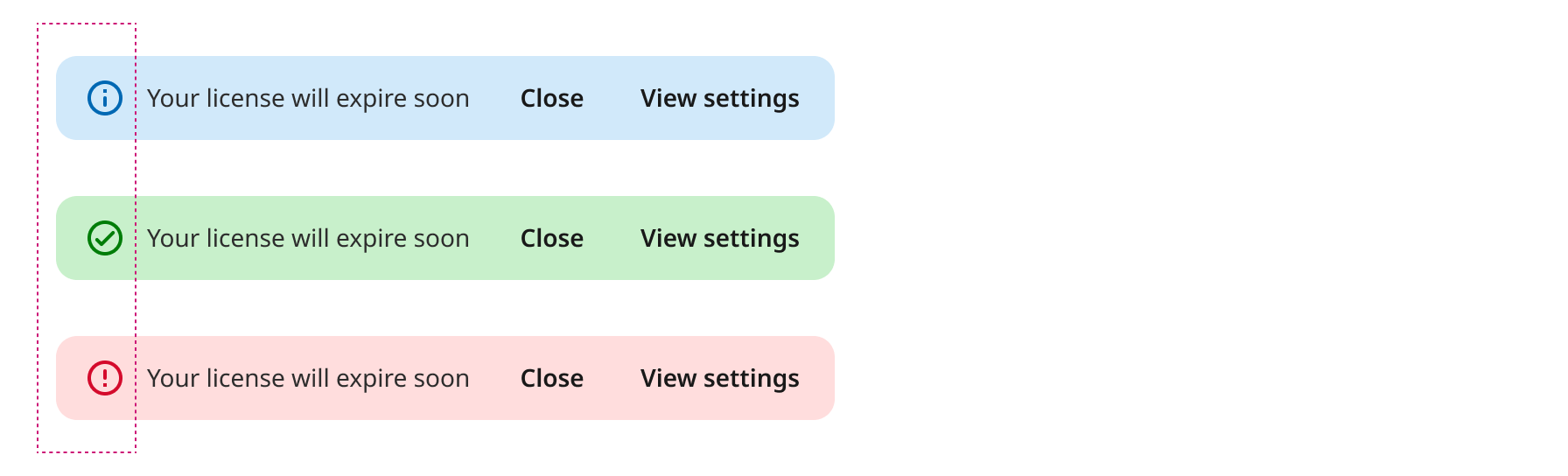
What are color roles?
- Color roles are mapped to the Components. You'll use these color roles whether you're using the static baseline scheme or dynamic color. If your product contains custom components, they'll need to be properly mapped to this set of color roles.
- Color roles ensure accessibility. The color system is built on accessible color pairings. These color pairs provide an accessible minimum 3:1 contrast.
- Color roles are tokenized. Roles are implemented in design and code through tokens. A design token represents a small, reusable design decision that’s part of a design system's visual style.
Surfaces
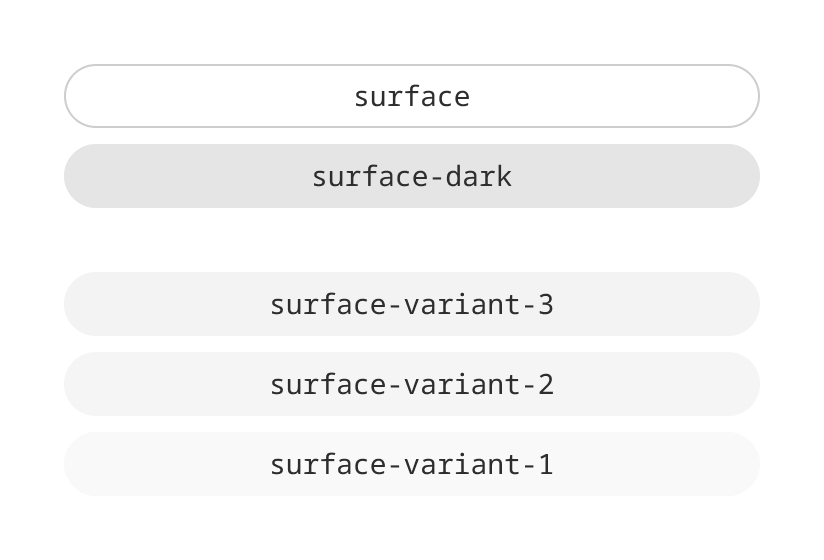
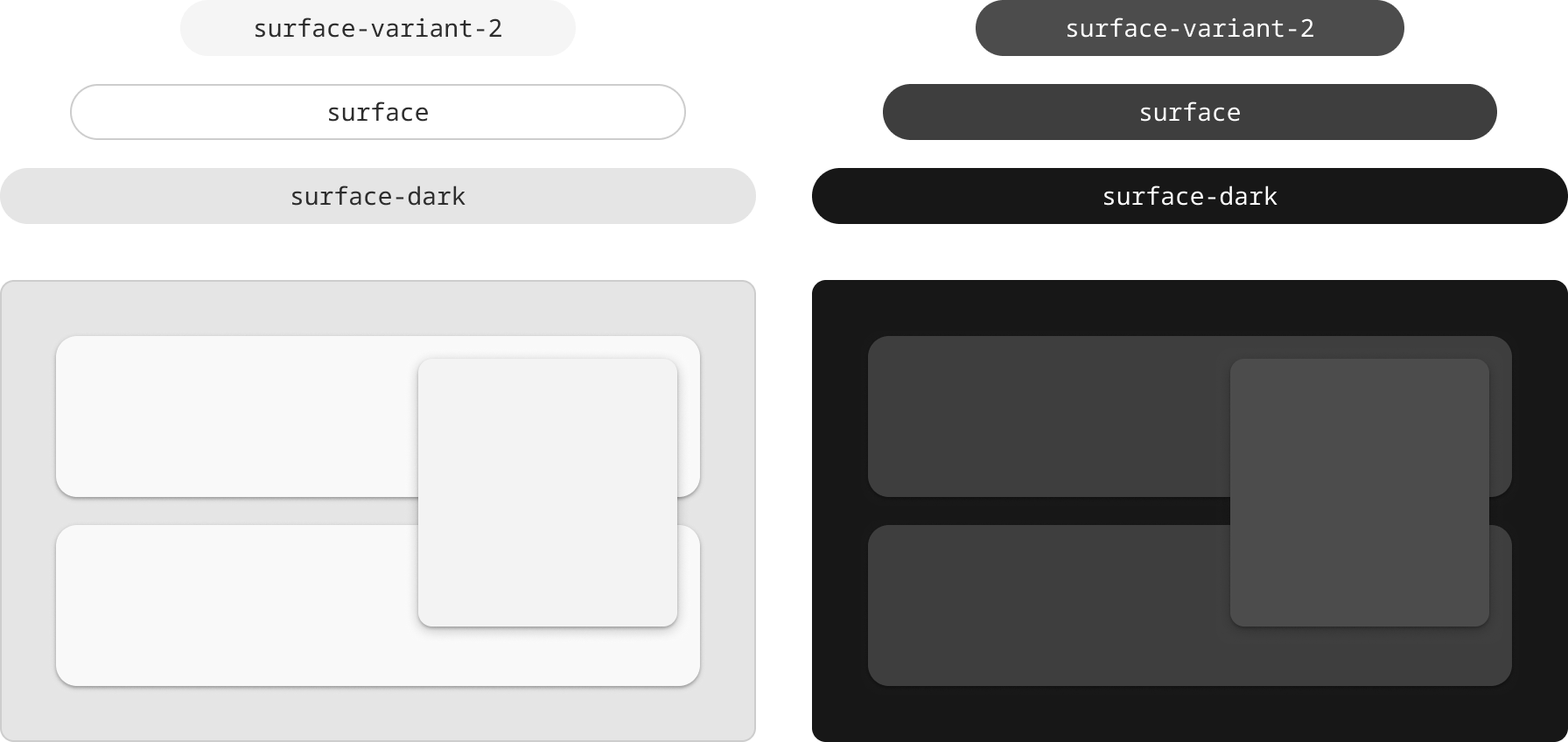
Surface colors define contained areas, distinguishing them from a background and other on-screen elements. There are two core surface roles: surface and surface-dark. In addition to elevation roles: surface-variant-1 ... -3.
On surface colors
Whenever elements such as text or icons appear in front of those surfaces, their colors be clear and legible against the color behind them.
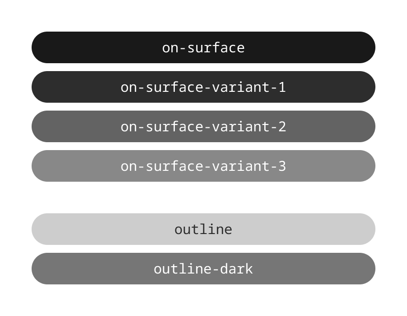
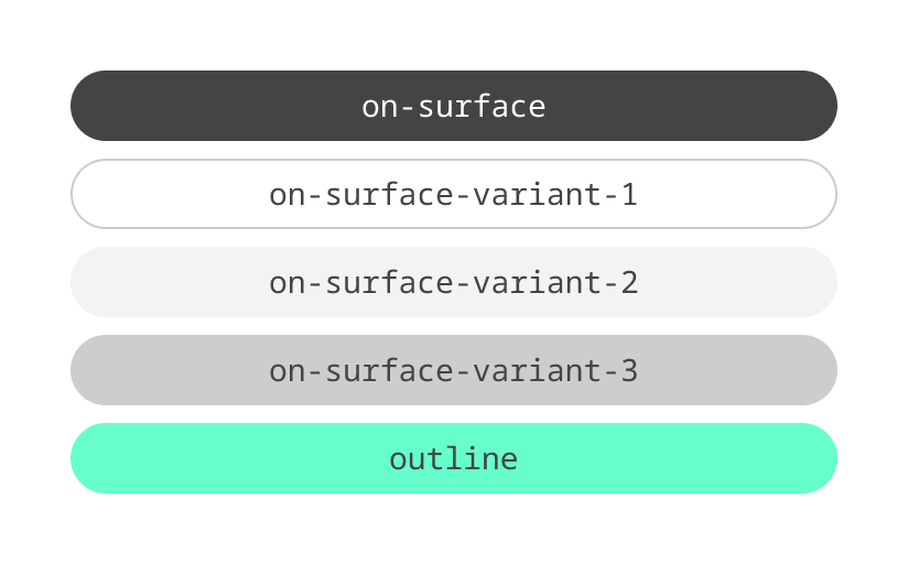
This type of color is called an “on” color, referring to the fact that it appears “on” top of surfaces. “On” colors are primarily applied to text, icons, and strokes.
Mapping
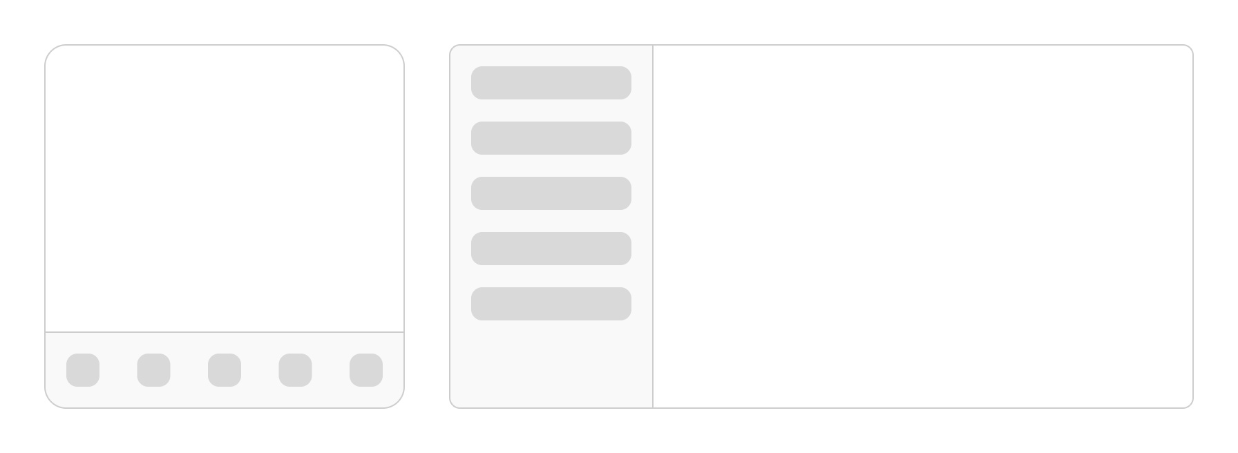
Surface color is the recommended default color for a body region of the app. It provides good contrast and can be flexibly combined with all other surface roles and content colors.
In the example below, a mobile device uses surface for the body region and surface varient for the navigation region. When the same application scales to a larger device, these color mappings remain the same for their layout regions.
Surface container colors
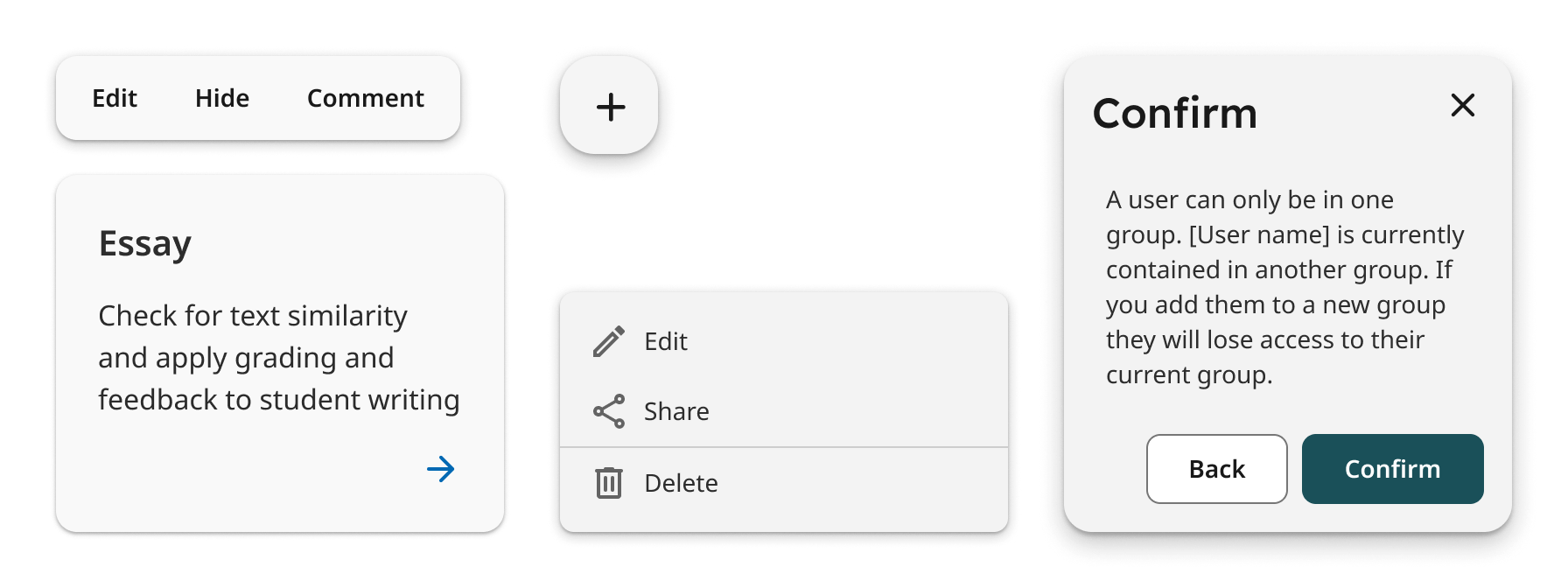
Neutral-colored components such as action bar, card, menus, or dialogs are mapped to specific surface-variant roles by default.
Alternative surface colors
Additional surface color role are variants to the default surface role. Surface-dark will always be the dimmest surface color in light or dark themes.
Inverse roles
These additional role mappings exist in a scheme and are mapped to components where needed.
Outlines
Outline is a utility color that creates boundaries for decorative elements when a 3:1 contrast isn’t required, such as for dividers or decorative elements.
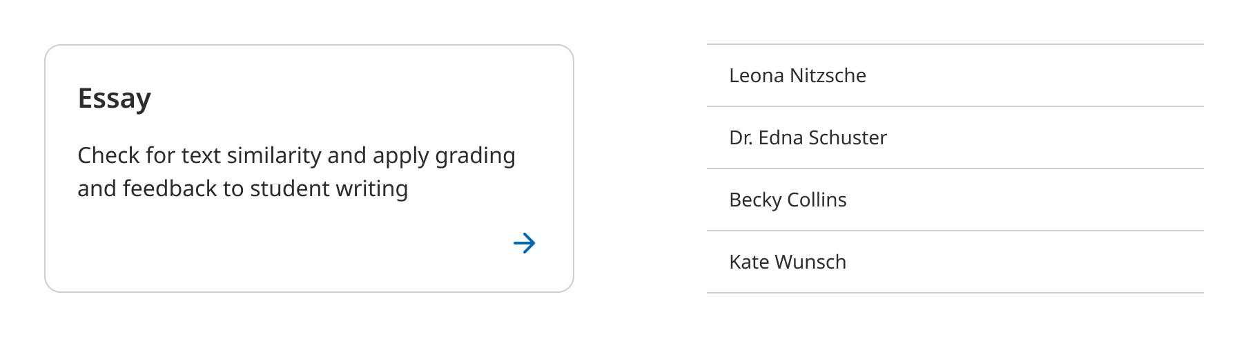
Outline-dark is a utility color that creates boundaries and emphasis to improve usability. The outline color has a 3:1 contrast with all surface colors.

Surfaces and elevation
Surfaces at different elevations do the following:
- Allow surfaces to move in front of and behind other surfaces, such as content scrolling behind navigation bar
- Reflect spatial relationships, such as how a floating action button’s shadow indicates it is separate from a card collection
- Focus attention on the highest elevation, such as a dialog temporarily appearing in front of other surfaces
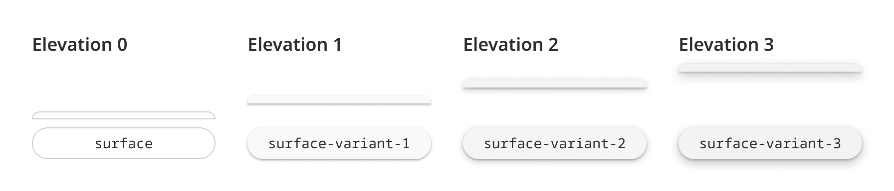
Find more in Surfaces and Elevation guidelines
Accent colors
Acent colors is used to derive roles for key components across the UI, buttons, active states.
Primary
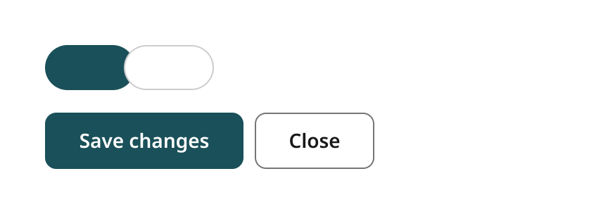
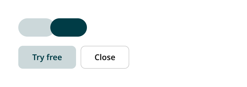
Primary roles are used for key components across the UI, buttons.
An “on-color” is a color role used by the content. Each container color has its own corresponding on color. For example, if a container color is “primary-container”, the content will use the “on-primary-container” color role.
Secondary
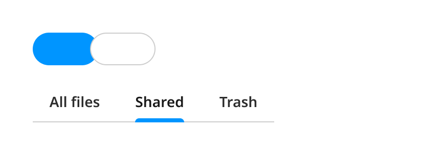
Secondary roles are used for less prominent components in the UI, such as filter chips, while expanding the opportunity for color expression.
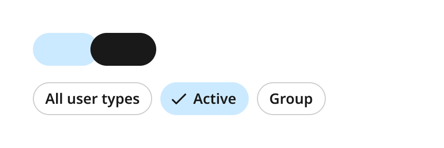
Product-specific colors
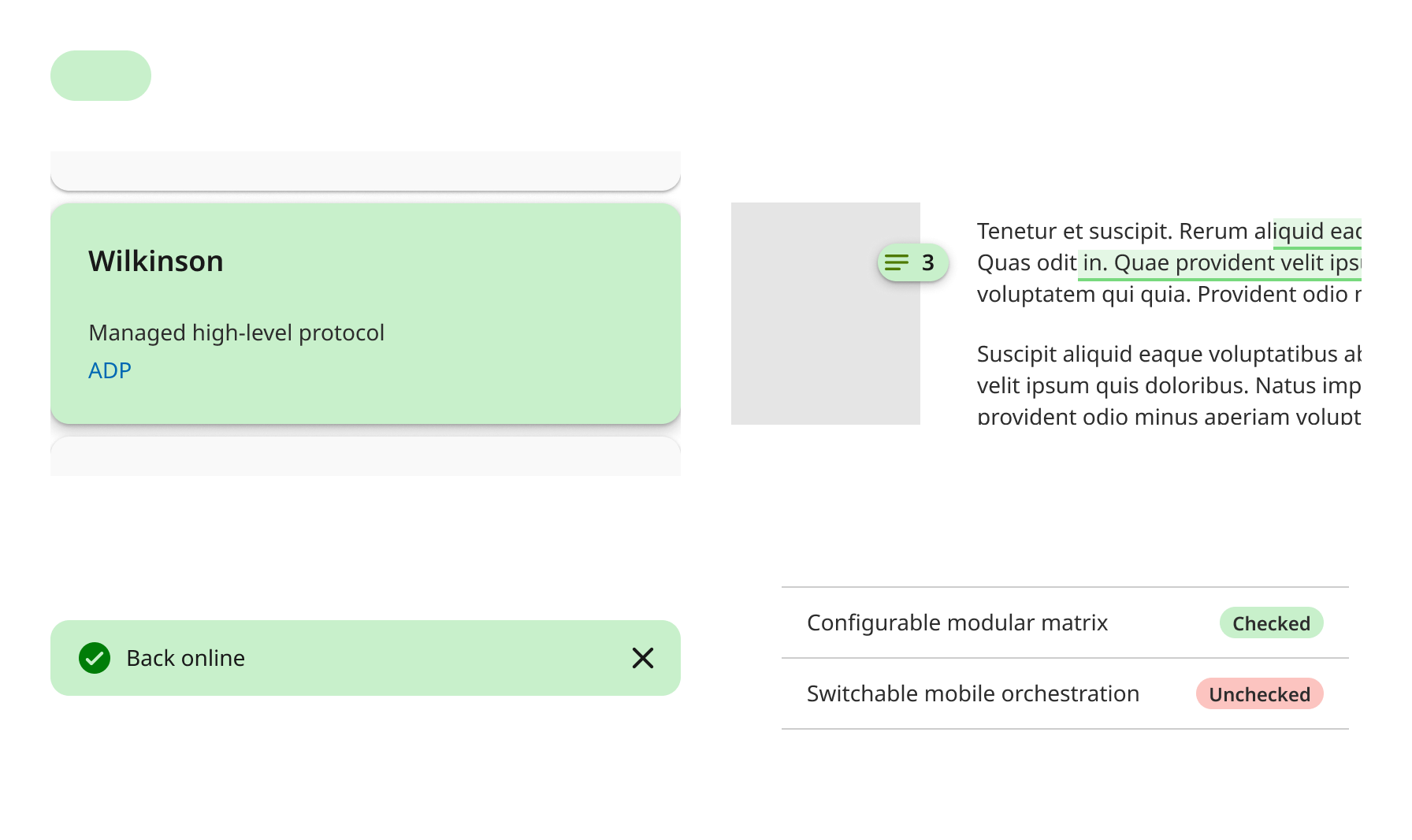
Custom colors have no semantic meaning attached to them. They can be used to show relationships between content types (e.g., features, categorization, labels, badges).
Custom colors used to give teams more control and customization alongside the variability of a dynamic color environment.
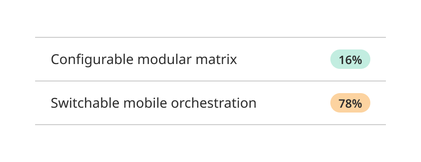
Custom color
Designed for stronger borders on interactive components,
- Component backgrounds
- Graphics
- Coloured shadows
- Accent borders
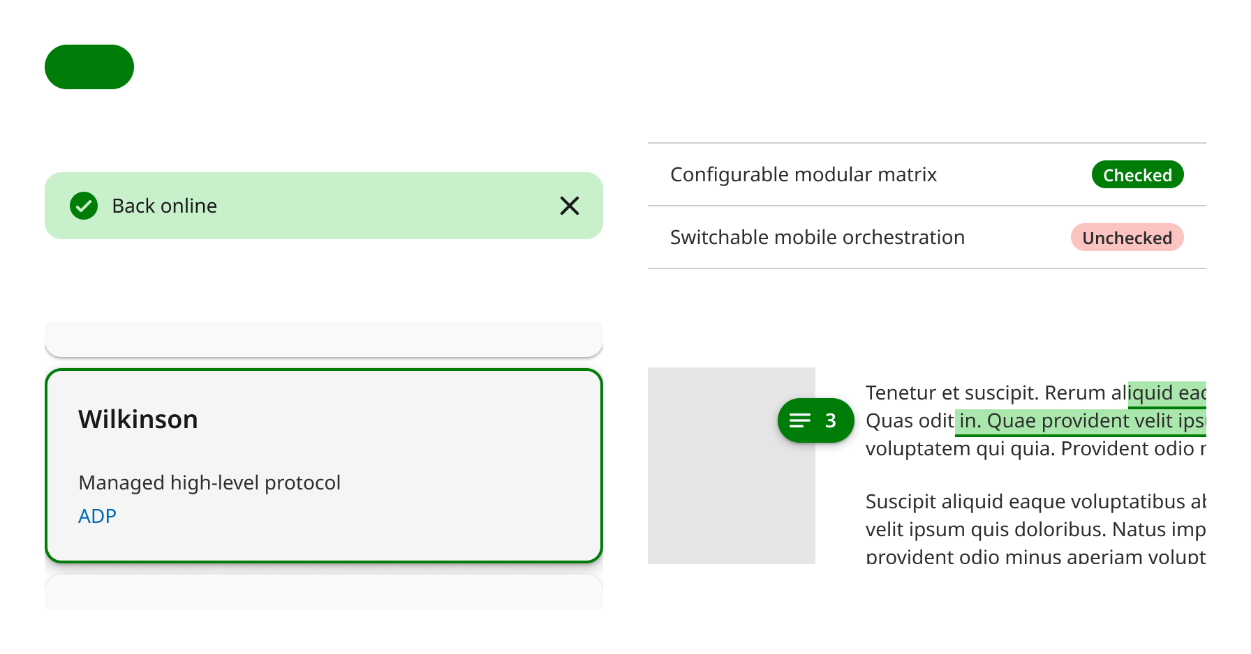
Custom color container (saturated)
Designed for subtle borders on interactive components and focus rings
- Hover states
- Pressed or selected states
- Overlays
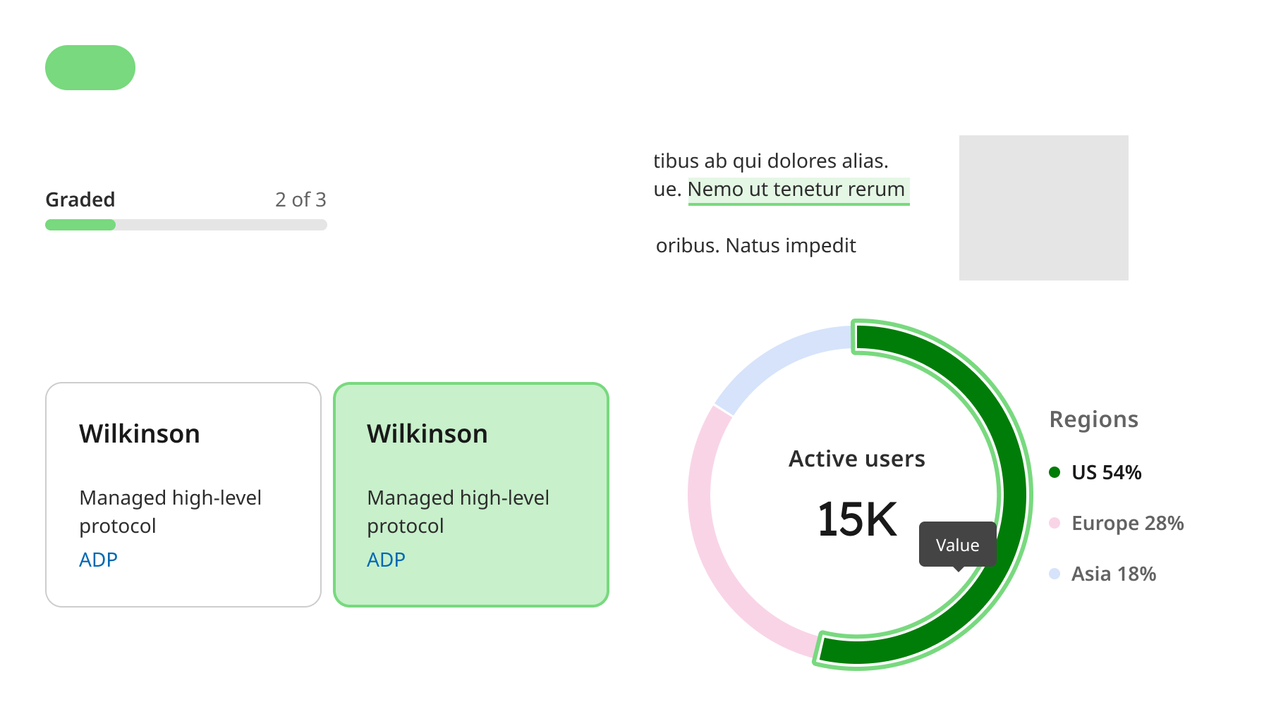
Custom color container
Designed for app backgrounds and subtle component backgrounds, subtle borders on components which are not interactive.
- Card background
- Badges
- Banners
- Notiffications
- Striped table background
- Sidebar background
- Canvas area background
Color variants
On colors
An “on-color” is a color role used by the content. Each container color has its own corresponding “on-color”.
For example, if a container color is secondary container, the content will use the on secondary container color role
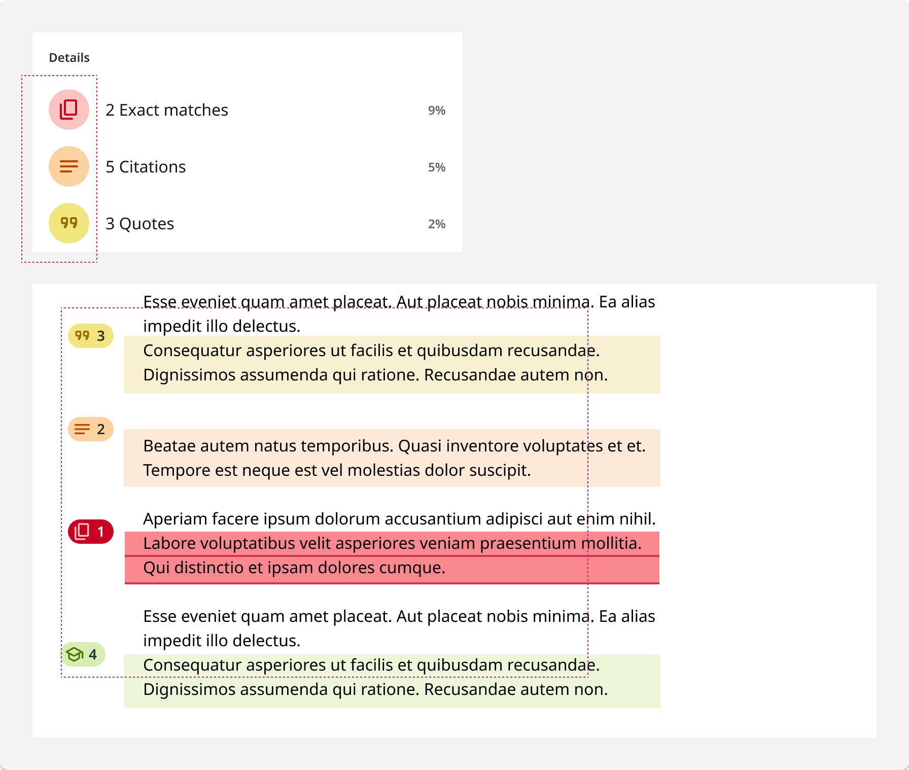
Two-tone color pairing
Two color tokens of the same hue can be combined to create subtle background colors with colored icons. These are used for actions or objects that need additional visual distinction in the interface.
Semantic colors
Semantic colors have assigned meanings and are used to set expectations of meaning for users.
The semantic meanings include “informative,” “negative,” “notice,” and “positive.” Use semantic colors as a clear and predictable way to communicate meaning through a component’s appearance.
Color should never be used by itself for communication.
Semantic color
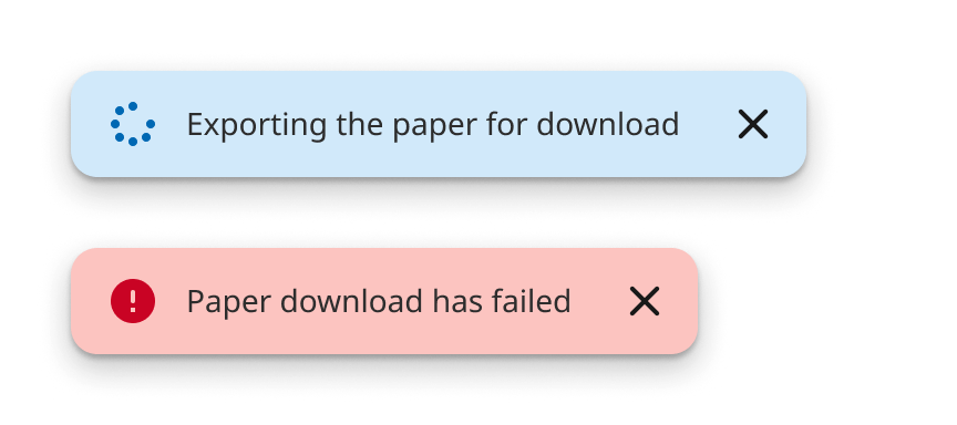
Works best for small or tiny elments like a text, borders or icons.
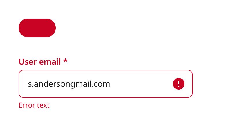
Semantic color container (saturated)
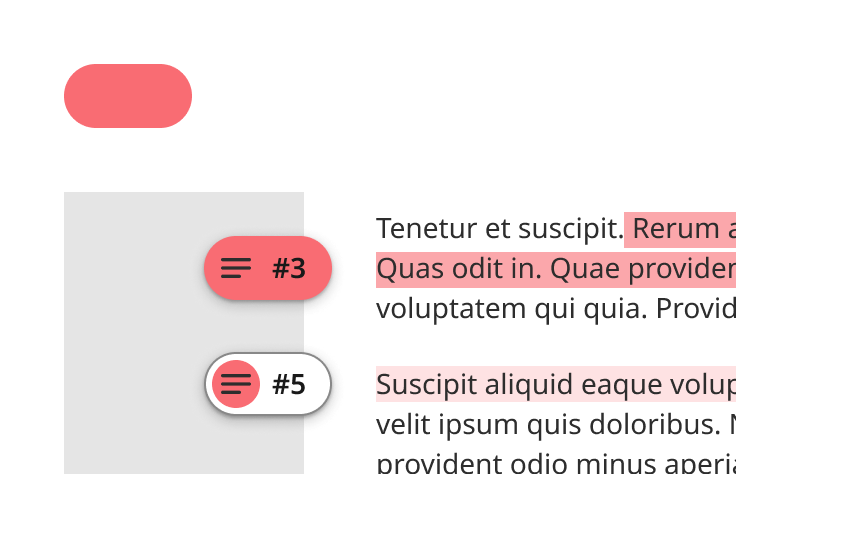
Works best to color small and medium size areas like a chip or badge.
Semantic color container
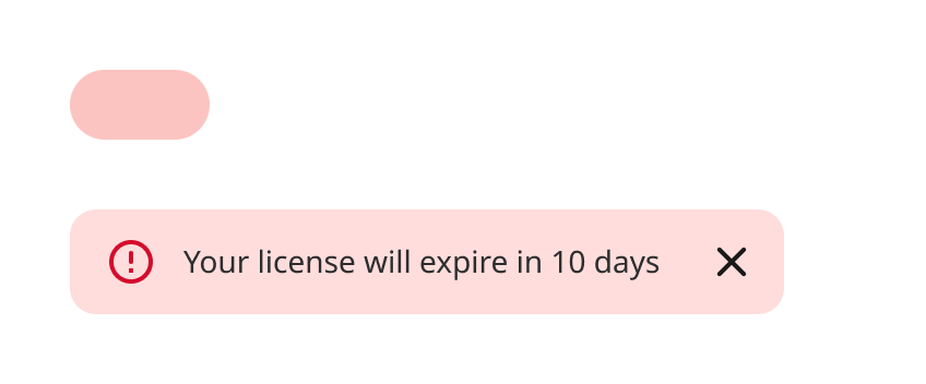
Works best to color large areas like banners, toasts or cards.
Semantic variants
On colors
An “on-color” is a color role used by the content. Each container color has its own corresponding “on-color”.
For example, if a container color is secondary container, the content will use the on secondary container color role
Two-tone color pairing
Two color tokens of the same hue can be combined to create subtle background colors with colored icons. These are used for actions or objects that need additional visual distinction in the interface.